MAPS & GRAPHS
State of the Baltic Sea 2023
All the maps, figures, and photos from the State of the Baltic Sea 2023 summary report can be downloaded here.

Figure ES1.
Summary of the integrated assessment results of pressures and status for the Baltic Sea showing the proportion of the Baltic Sea in the different assessment status categories (based on square kilometres). Integrated assessment results are shown in five categories with three representing degrees of poor status and two representing degrees of good status, as shown in more detail in the different chapters of the report.

Figure ES2.
Summary of the integrated assessment results of pressures and status across topics presented by the sub-basins of the Baltic Sea. For each sub-basin, each petal refers to a pressure or biodiversity ecosystem component according to its position in the flower shape, as shown in the figure legend. White petals are shown when no assessment is available, or when the assessment is currently incomplete. Integrated assessment results are shown in five categories. Further details on the assessment results are shown in the different chapters of this report, which also includes information on the status of marine litter, non-indigenous species, underwater sound, seabed loss and disturbance which are not included here as it is either not possible to aggregate the integrated assessment to sub-basin level, or no integrated assessment was available in HOLAS 3.

Figure ES3.
Status of pressure-based core indicators for hazardous substances and non-indigenous species, marine litter, underwater noise and eutrophication by sub-basin. For eutrophication the sub-basin Bornholm basin has been separated into Bornholm basin and Pomeranian bay and the sub-basin Gulf of Finland has been separated into Gulf of Finland and Eastern Gulf of Finland. Green circles indicate good status, red circles indicate not good status, and white circles indicate that the core indicator is applicable or relevant to the sub-basin, but has not been evaluated. Empty points indicate that the indicator is not applicable or relevant. For coastal indicators, pie charts show proportion of coastal assessment units per sub-basin in good status (green), not good status (red) and not evaluated (white).

Figure ES4.
Status of biodiversity core indicators by sub-basin. Green circles indicate good status, red circles indicate not good status. White circles indicate that the core indicator is applicable for the sub-basin, but has not been evaluated. Empty points indicate that the indicator is not applicable. For coastal indicators, pie charts show proportion of coastal assessment units per sub-basin in good status (green), not good status (red) and not evaluated (white).

Figure 1.1.
The four main segments of the Baltic Sea Action Plan (BSAP) focus on Biodiversity, Eutrophication, Hazardous substances and litter, and Sea-based activities. These segments support each other and share cross-cutting topics. The cross-cutting topic of the BSAP are climate change, monitoring, maritime spatial planning, economic and social analyses, knowledge exchange and awareness raising, hot spots, and financing.

Figure 1.2.
The EU Marine Strategy Framework Directive aims for good environmental status based on eleven descriptors covering different aspects of the marine environment.

Figure 1.3.
Sustainable Development Goals and their links with HOLAS 3, based on information in the 2021 HELCOM Baltic Sea Action Plan (BSAP).

Figure 1.4.
The spatial assessment units are a key tool for carrying out regional assessments coherently across the wide variety of topics and features of HOLAS while ensuring that each is assessed at an ecologically relevant scale.

Figure 1.5.
The conceptual management framework HELCOM works in and within which the holistic assessment is made. As a basis for further development of the holistic assessment, HELCOM has used a version of the Driver-Activities-Pressures-State-Impacts-Response (DAPSIR) framework, modified to fit the work under HELCOM and address the needs of the holistic assessment. This approach has been taken to strengthen the holistic aspect of the assessment, providing a clearer picture both of what we know across interlinked elements of the framework and of areas where further development or information is needed. In the modified management framework, Response has been replaced with Measures, reflecting the terminology used in the Baltic Sea Action Plan, and the definition of Impact has been expanded to include both perspectives presented in the assessment: impact on the environment and on society. The majority of the assessment work focuses on the environmental perspective (HELCOM 2023a, HELCOM 2023b, HELCOM 2023c, HELCOM 2023e), with the assessments presented under the Thematic Assessment on Economic and Social Analyses (HELCOM 2023d) representing the societal perspective.

Figure 2.1.
The clear majority of the macrospecies in the Baltic Sea are benthic invertebrates. The other main species groups are macrophytes (including algae, vascular plants and bryophytes), followed by fish. Phytoplankton diversity includes the currently known planktonic microalgae and cyanobacteria.
, also known as Eurasian sea eagle and white-tailed sea-eagle. The eagle is flying to catch a fish in the delta of the river Oder in Poland, Europe.")
Figure 2.2.
Species in all parts of the food web are affected by changes in the Baltic Sea environment.

Figure 2.3.
The Baltic Sea is facing complex effects and feedbacks between climatic and non-climatic factors, as well as between the effects of climate change on different parts of the ecosystem. Source: HELCOM/Baltic Earth 2021.

Figure 2.4.
The combination of biodiversity degradation and climate change creates a particularly challenging situation for plant and animals to adapt to changing environmental conditions.
© John Nurminen Foundation

Figure 2.5.
Changes in temperature. Annual mean values of daily sea surface temperature (left column) and bottom temperature (right column) at seven monitoring stations in the Baltic Sea during 1877–2018 (red dots). The grey lines indicate the period when every station has data for every year (1954–2018). The data shown has been post-processed to overcome possible seasonal biases due to missing values in the observations. For data sources and more details, see Meier et al. (2022).

Figure 2.6.
Changes in the maximum extent of ice cover in the Baltic Sea in the winter. The line shows a 15-year moving average. Source: EEA 2022.

Figure 2.7.
Ice conditions in the winter is an important indicator of climate change in the Baltic Sea.

Figure 2.8.
The extent of areas with hypoxic (<2 mL O2 L−1) and anoxic (<0 mL O2 L−1) bottom water in the Baltic Proper, the Gulf of Finland, and the Gulf of Riga during regular cruises in August–October during 1960–2020. Source: Hansson and Viktorsson 2023.

Figure 2.9.
The Baltic Sea and its drainage area.

Figure 2.10.
The variety of habitats in the Baltic Sea contribute to biodiversity and to a wide range of ecosystem services of importance to humans.
© Juuso Haapaniemi

Figure 2.11.
Value of landings (million €) 2013 – 2019. Shading indicates the years included in the HOLAS 3 assessment period. Source: STECF 2021b. All monetary values have been adjusted for inflation; constant prices (2015) using Eurostat (2022i). STECF does not report on Russia.

Figure 2.12.
Passengers embarked and disembarked at all ports (thousand persons) 2011 – 2019. Shading indicates the years included in the HOLAS 3 assessment period. Source: Eurostat 2022e. Eurostat does not report on Russia.

Figure 2.13.
Installed offshore wind power capacity 2011 – 2021. Shading indicates the years included in the HOLAS 3 assessment period. Source: Eurostat 2022g, EMODnet 2022a. Eurostat does not report on Russia. See also Figure 5.6.

Figure 2.14.
Number of nights spent at tourist accommodation establishments in coastal areas (million nights) 2012 – 2019. Shading indicates the years included in the HOLAS 3 assessment period.

Figure 2.15.
The importance of healthy and functioning ecosystems for human well-being is too often underestimated or poorly recognized in planning and decision-making. To realize the sustainable use of marine ecosystems, we must find a balance between the values we extract from the environment and the negative impact we cause.

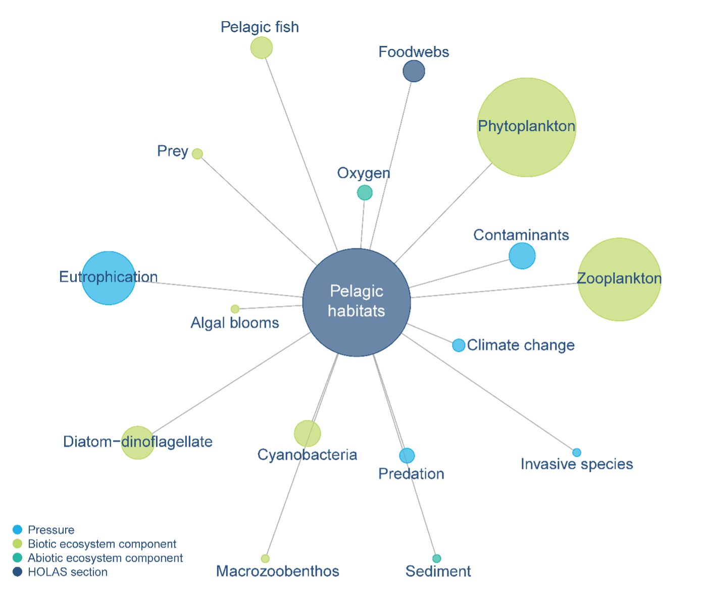
Figure 3.2.
An overview of the ecosystem components and pressures descriptively linked to the status of pelagic habitats in HOLAS 3. The figure reflects aspects highlighted in the chapter on this topic in the HOLAS 3 thematic assessment report on biodiversity (HELCOM 2023a), based on the terms used and interlinkages made. The chapter itself is symbolised by the dark blue circle in the centre, and the other circles represent the key elements (terms) used in the chapter. The size of each circle is based on how often the term is mentioned in the chapter and should only be interpreted in this way. The terms are aggregated, so each circle includes both the term itself and all terms deemed to be synonymous (e.g. “eutrophication” includes “eutrophication” and associated terms such as “nutrient input” or “concentrations”). The width and length of the lines and the placement of the items is arbitrary. The image gives a simple visual representation of the topics covered in the evaluation, while simultaneously providing a gap analysis of where more information may be required in the future to increase the holistic nature of the evaluation (e.g. if an interaction between a certain pressure and an ecosystem component has not been well addressed). The overview was made using igraph.

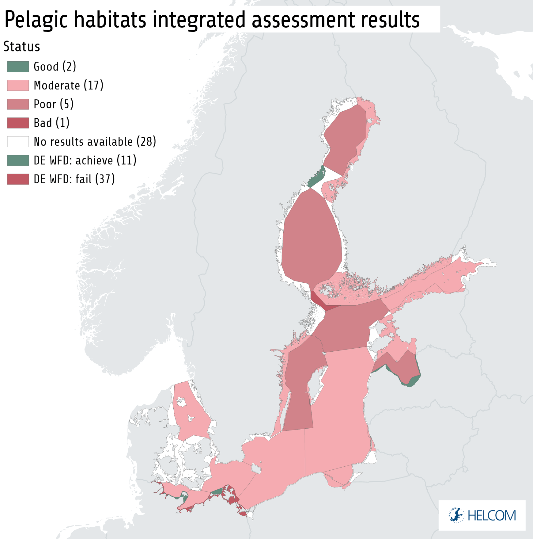
Figure 3.3.
Summary of results from the integrated assessment of pelagic habitats. Source: HELCOM 2023a.

Figure 3.4. (Productive surface waters)
Distribution of pelagic habitat. Left: Productive surface waters are represented by the concentration of chlorophyll-a during spring. Higher values indicate areas with more chlorophyll-a in surface waters. The dataset was prepared by the Finnish Environment Institute. Right: Bottom-water habitats not influenced by permanent anoxia. Areas with low values are more influenced by anoxia. High values thus indicate suitable habitats for biota with respect to oxygen condition. The map was prepared based on the occurrence of hydrogen sulphide near the sea bottom. Importantly, the map only shows areas with permanent anoxia, and information on this is only available for open sea areas. Additional areas experience various degrees of temporary oxygen deficiency. For example, anoxia in coastal waters is often temporary in nature (HELCOM 2023h). Data were provided by the Leibniz Institute for Baltic Sea Research Warnemünde (IOW) and are based on point measurements and modelling for five periods per year during 20162021. Source: HELCOM 2023e.

Figure 3.4. (Bottom-water habitats)
Distribution of pelagic habitat. Left: Productive surface waters are represented by the concentration of chlorophyll-a during spring. Higher values indicate areas with more chlorophyll-a in surface waters. The dataset was prepared by the Finnish Environment Institute. Right: Bottom-water habitats not influenced by permanent anoxia. Areas with low values are more influenced by anoxia. High values thus indicate suitable habitats for biota with respect to oxygen condition. The map was prepared based on the occurrence of hydrogen sulphide near the sea bottom. Importantly, the map only shows areas with permanent anoxia, and information on this is only available for open sea areas. Additional areas experience various degrees of temporary oxygen deficiency. For example, anoxia in coastal waters is often temporary in nature (HELCOM 2023h). Data were provided by the Leibniz Institute for Baltic Sea Research Warnemünde (IOW) and are based on point measurements and modelling for five periods per year during 20162021. Source: HELCOM 2023e.

Figure 3.5.
An overview of the ecosystem components and pressures descriptively linked to the status of benthic habitats in HOLAS 3. The figure reflects aspects highlighted in the chapter on this topic in the HOLAS 3 thematic assessment report on biodiversity (HELCOM 2023a), based on the terms used and interlinkages made. The chapter itself is symbolised by the dark blue circle in the centre, and the other circles represent the key elements (terms) used in the chapter. The size of each circle is based on how often the term is mentioned in the chapter and should only be interpreted in this way. The terms are aggregated, so each circle includes both the term itself and all terms deemed to be synonymous (e.g. “eutrophication” includes “eutrophication” and associated terms such as “nutrient input” or “concentrations”). The width and length of the lines and the placement of the items is arbitrary. The image gives a simple visual representation of the topics covered in the evaluation, while simultaneously providing a gap analysis of where more information may be required in the future to increase the holistic nature of the evaluation (e.g. if an interaction between a certain pressure and an ecosystem component has not been well addressed). The overview was made using igraph.

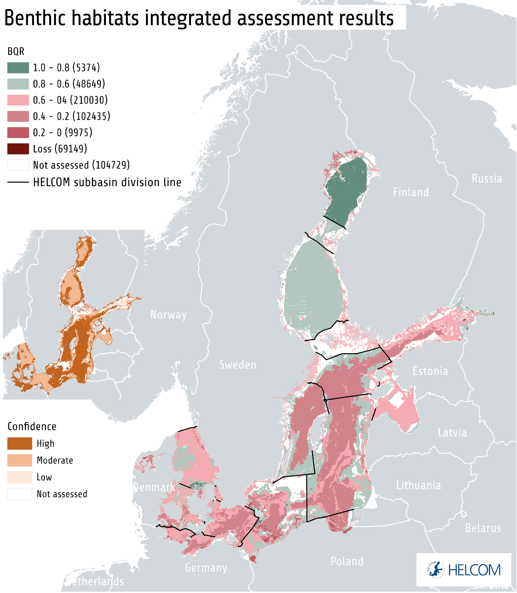
Figure 3.6.
Summary of results from the integrated assessment of benthic habitats. Biological quality ratios (BQR) above 0.6 correspond to good status. Assessment confidence is presented in the inset map on the left. Source: HELCOM 2023a.

Figure 3.7. (A) Potamogeton
Distribution of a) Potamogeton spp, an important freshwater macrophyte in the Baltic Sea, b) Fucus spp, a brown macroalga, and c) the marine macrophyte Zostera marina (eelgrass). Source: HELCOM 2023a.

Figure 3.7. (B) Fucus
Distribution of a) Potamogeton spp, an important freshwater macrophyte in the Baltic Sea, b) Fucus spp, a brown macroalga, and c) the marine macrophyte Zostera marina (eelgrass). Source: HELCOM 2023a.

Figure 3.7. (C) Zostera
Distribution of a) Potamogeton spp, an important freshwater macrophyte in the Baltic Sea, b) Fucus spp, a brown macroalga, and c) the marine macrophyte Zostera marina (eelgrass). Source: HELCOM 2023a.

Figure 3.8.
An overview of the ecosystem components and pressures descriptively linked to the status of fish in HOLAS 3. The figure reflects aspects highlighted in the chapter on this topic in the HOLAS 3 thematic assessment report on biodiversity (HELCOM 2023a), based on the terms used and interlinkages made. The chapter itself is symbolised by the dark blue circle in the centre, and the other circles represent the key elements (terms) used in the chapter. The size of each circle is based on how often the term is mentioned in the chapter and should only be interpreted in this way. The terms are aggregated, so each circle includes both the term itself and all terms deemed to be synonymous (e.g. “eutrophication” includes “eutrophication” and associated terms such as “nutrient input” or “concentrations”). The width and length of the lines and the placement of the items is arbitrary. The image gives a simple visual representation of the topics covered in the evaluation, while simultaneously providing a gap analysis of where more information may be required in the future to increase the holistic nature of the evaluation (e.g. if the interaction between a pressure and an ecosystem component has not been well addressed). The overview was made using igraph.

Figure 3.9.a
Summary of results from the integrated assessment of commercial fish. Biological quality ratios (BQR) and Ecological Quality Ratio (EQR) above 0.6 correspond to good status. Assessment confidence is presented in the inserted small maps. The spatial assessment units for commercial fish are the ICES sub-divisions. Source: HELCOM 2023a.

Figure 3.9.b
Summary of results from the integrated assessment of coastal fish. Biological quality ratios (BQR) and Ecological Quality Ratio (EQR) above 0.6 correspond to good status. Assessment confidence is presented in the inserted small maps. Source: HELCOM 2023a.

Figure 3.10.
An overview of the ecosystem components and pressures descriptively linked to the status of waterbirds in HOLAS 3. The figure reflects aspects highlighted in the chapter on this topic in the HOLAS 3 thematic assessment report on biodiversity (HELCOM 2023a), based on the terms used and interlinkages made. The chapter itself is symbolised by the dark blue circle in the centre, and the other circles represent the key elements (terms) used in the chapter. The size of each circle is based on how often the term is mentioned in the chapter and should only be interpreted in this way. The terms are aggregated, so each circle includes both the term itself and all terms deemed to be synonymous (e.g. “eutrophication” includes “eutrophication” and associated terms such as “nutrient input” or “concentrations”). The width and length of the lines and the placement of the items is arbitrary. The image gives a simple visual representation of the topics covered in the evaluation, while simultaneously providing a gap analysis of where more information may be required in the future to increase the holistic nature of the evaluation (e.g. if an interaction between a certain pressure and an ecosystem component has not been well addressed). The overview was made using igraph.

Figure 3.11.
Summary of reults from the integrated assessment of waterbirds. Biological quality ratios (BQR) above 0.6 correspond to good status. Assessment confidence is presented in the map inserted to the left. Source: HELCOM 2023a.

Figure 3.12.
An overview of the ecosystem components and pressures descriptively linked to the status of marine mammals in HOLAS 3. The figure reflects aspects highlighted in the chapter on this topic in the HOLAS 3 thematic assessment report on biodiversity (HELCOM 2023a), based on the terms used and interlinkages made. The chapter itself is symbolised by the dark blue circle in the centre, and the other circles represent the key elements (terms) used in the chapter. The size of each circle is based on how often the term is mentioned in the chapter and should only be interpreted in this way. The terms are aggregated, so each circle includes both the term itself and all terms deemed to be synonymous (e.g. “eutrophication” includes “eutrophication” and associated terms such as “nutrient input” or “concentrations”). The width and length of the lines and the placement of the items is arbitrary. The image gives a simple visual representation of the topics covered in the evaluation, while simultaneously providing a gap analysis of where more information may be required in the future to increase the holistic nature of the evaluation (e.g. if an interaction between a certain pressure and an ecosystem component has not been well addressed). The overview was made using igraph.

Figure 3.13.
Summary of assessment results from the assessment of marine mammals (seals).. Biological quality ratios (BQR) above 0.6 correspond to good status. Assessment confidence is presented in the map inserted on the left-hand side. Source: HELCOM 2023a.

Figure 3.14.
In the 19th and early 20th centuries, harbour porpoises were widespread throughout the entire Baltic, occurring as far as the inner parts of the Gulf of Bothnia and the Gulf of Finland. The harbour porpoise population in the Baltic Proper has declined dramatically over the past 100 years. Today, harbour porpoise observations are very rare in the Baltic Proper. The number of individuals remaining is estimated to be a few hundred at most (HELCOM 2023a), and there are indications that this population is facing extinction (HELCOM 2013b).

Figure 3.15. Grey seals
Distributional range of A) grey seals, B) ringed seals, C) harbour seals (based on expert input), D) Harbour porpoise. Source: HELCOM 2023e.

Figure 3.15. Ringed seals
Distributional range of A) grey seals, B) ringed seals, C) harbour seals (based on expert input), D) Harbour porpoise. Source: HELCOM 2023e.

Figure 3.15. Harbour seals
Distributional range of A) grey seals, B) ringed seals, C) harbour seals (based on expert input), D) Harbour porpoise. Source: HELCOM 2023e.

Figure 3.15. Harbour porpoise
Distributional range of A) grey seals, B) ringed seals, C) harbour seals (based on expert input), D) Harbour porpoise. Source: HELCOM 2023e.

Figure 3.16.
An overview of the ecosystem components and pressures descriptively linked to the status of food webs in HOLAS 3. The figure reflects aspects highlighted in the chapter on this topic in the HOLAS 3 thematic assessment report on biodiversity (HELCOM 2023a), based on the terms used and interlinkages made. The chapter itself is symbolised by the dark blue circle in the centre, and the other circles represent the key elements (terms) used in the chapter. The size of each circle is based on how often the term is mentioned in the chapter and should only be interpreted in this way. The terms are aggregated, so each circle includes both the term itself and all terms deemed to be synonymous (e.g. “eutrophication” includes “eutrophication” and associated terms such as “nutrient input” or “concentrations”). The width and length of the lines and the placement of the items is arbitrary. The image gives a simple visual representation of the topics covered in the evaluation, while simultaneously providing a gap analysis of where more information may be required in the future to increase the holistic nature of the evaluation (e.g. if an interaction between a certain pressure and an ecosystem component has not been well addressed). The overview was made using igraph.

Figure 3.17.
The Baltic Sea food web includes primary producers, which make energy and nutrients available to the ecosystem, primary consumers, which feed on the primary producers, and different levels of predators, which feed on lower trophic levels. It also includes species that use dead organic material and contribute to recycling energy and nutrients, and some species function as parasites. Natural food webs are often highly complex, as there are many links between species and a variety of feeding relationships.
© Sebastian Dahlström

Figure 4.1.
An overview of how the different ecosystem components mentioned in Chapter 3 are descriptively linked to different pressures, based on the HOLAS3 thematic assessment report on biodiversity (HELCOM 2023a). Each chapter in the thematic assessment is symbolised by a dark blue circle, and the other circles reflect the key elements (terms) used. The size of each circle loosely reflects how often the term is mentioned and should only be interpreted in this way. Similar terms are aggregated, so each circle includes both the term itself and all terms deemed to be synonymous (e.g. “eutrophication” includes “eutrophication” and associated terms such as “nutrient input” or “concentrations”). The width and length of the lines and the placement of the items is arbitrary. The image provides a simple visual representation of the topics and links covered, while simultaneously providing a gap analysis of where more information may be required in the future to increase the holistic nature of the evaluation (e.g. if the interaction between a certain pressure and an ecosystem component has not been well addressed). The overview was made using igraph.

Figure 4.2.
Pollution enters the Baltic Sea from a mix of sources, including direct point sources, freshwater discharges, rivers and the atmosphere.

Figure 4.3.
Summary of assessment results from the assessment of eutrophication. Source: HELCOM 2023b.

Figure 4.4.
Temporal development of waterborne inputs of total nitrogen (left) and total phosphorus (right) to the Baltic Sea. Source: HELCOM 2023b.

Figure 4.5. MAI-TN
Inputs of nitrogen (left) and phosphorus (right) to the Baltic Sea sub-basins, as these are defined in the HELCOM pollution load compilation. BAS=whole Baltic Sea. The columns show trend-based estimates of total nitrogen and phosphorus inputs in 2020, in tons per year and including statistical uncertainty. The short blue lines show the maximum allowable inputs (MAI). Green indicates that the estimated inputs, including uncertainty, were lower than MAI, while red indicates that they exceeded MAI. Yellow indicates that the statistical uncertainty of the input data makes it not possible to determine whether MAI was fulfilled. Note that the scale of the y-axis differs between charts. Source: HELCOM 2023f.

Figure 4.5. MAI-TP
Inputs of nitrogen (left) and phosphorus (right) to the Baltic Sea sub-basins, as these are defined in the HELCOM pollution load compilation. BAS=whole Baltic Sea. The columns show trend-based estimates of total nitrogen and phosphorus inputs in 2020, in tons per year and including statistical uncertainty. The short blue lines show the maximum allowable inputs (MAI). Green indicates that the estimated inputs, including uncertainty, were lower than MAI, while red indicates that they exceeded MAI. Yellow indicates that the statistical uncertainty of the input data makes it not possible to determine whether MAI was fulfilled. Note that the scale of the y-axis differs between charts. Source: HELCOM 2023f.

Figure 4.6.
Various drivers determine the extent and efficiency of wastewater treatment in the Baltic Sea region, including political will, investment, regulations and the adoption of technology. Overall, 72% of the Baltic Sea catchment area population is connected to tertiary wastewater treatment plants (Eurostat 2022). The bar charts show the percentage of the total population connected to tertiary wastewater treatment plants in Baltic Sea countries in 2020. The chart does not include data from Russia or any non-HELCOM countries. Source: HELCOM 2023d.

Figure 4.7.
The integrated assessment of hazardous substances status in the Baltic Sea, assessed using the CHASE integrated assessment tool. The assessment shows that hazardous substances are a cause for concern in almost all assessed units, and those showing good status generally lack a full and adequate assessment. The integrated assessment is based on 11 core indicators. It integrates concentrations to threshold-derived values (contamination ratios) for fourteen individual hazardous substances or substance groups. The overall assessment is moderated by a parallel assessment of confidence (see inset map on the left) that can be considered an appraisal of the data coverage and assessment quality in any given assessment unit. Source: HELCOM 2023c.

Figure 4.8.
Trends in indicator substances or substance groups based on stations where “full” data series were available (i.e. longer-term data series with more than three years of data). The number of stations with suitable time series data available (horizontal axis) is divided into trend categories. Downward trends reflect a decrease in concentrations (i.e. improving status), whereas the opposite is true for upward trends, and other stations show no detectable trend (“stable” concentrations). Source: HELCOM 2023c.

Figure 4.9.
The range of contamination ratios of the evaluated hazardous substances. The ratios are the observed concentration value divided by the threshold value, based on the mean concentrations for the assessment period 2016-2021. The horizontal bars show the range of contamination ratios from the 20th to 75th percentile for each substance on a log-transformed scale. Red bars indicate that the median value fails the threshold value, which is indicated by the solid blue line. Orange bars represent a situation where the median value achieves the threshold value but not some of the stations (in the 75th percentile). The figure is based on the coastal and open sea data used in the integrated assessment. Source: HELCOM 2023c.

Figure 4.10.
The impact of marine litter on the marine environment is closely linked to human behaviour.

Figure 4.11.
Sampling locations of sea-floor litter (red) and depth (shades of blue, darker indicating deeper). Note that deep locations and the north and north-eastern parts of the Baltic are not currently sampled, and that the depth map is not aligned with HELCOM assessment unit borders. Sampling of sea-floor litter was started in 2011, by its inclusion in the Baltic Sea International Trawl Survey, but litter categories and sample codes were not fully standardised until 2015. Source: HELCOM 2023c.

Figure 4.12.
Lost fishing gear can end up on land, but most often it remains in the sea where it can continue trapping marine animals for a long time.

Figure 4.13.
The number of non-indigenous species (NIS) or cryptogenic species (CS) introduced to the Baltic Sea over time. The bars indicate the number of new introduced species per time period. Note that the lengths of the last two time periods differ from the others, covering intervals of six instead of ten years. There is a discrepancy between the statistics presented in this figure and the assessment results presented in the text because of retrospective reporting of many new non-indigenous species after the publication of the previous holistic assessment (HELCOM 2018). The threshold value for good status is 0 new introductions. Data are from the Information system on aquatic non-indigenous and cryptogenic species (AquaNIS). Source: HELCOM 2023c.

Figure 4.14.
The round goby (Neogobius melanostomus) is an example of a non-indigenous species that has taken a major role in the Baltic Sea food web, leading to impacts on several other species.

Figure 4.15.
Non-indigenous species impacts in the Baltic Sea, as presented in HELCOM (2023e). The layer indicates the cumulative negative impacts on marine biodiversity caused by non-indigenous species based on the index CIMPAL (Cumulative IMPact of ALien species (Katsanevakis et al. 2016). The map shows the normalized pressure values, with increased colour intensity indicating higher pressure. Source: HELCOM 2023e.

Figure 4.16. Median sound pressure
Illustration of continuous underwater noise in the Baltic Sea. The upper map shows the median sound pressure level (SPL, dB ref 1µPa2) for the third octave band 125 Hz in March 2028, and the map below shows the median excess level (SPL, dB ref 1µPa2) for the same. The maps represents the time of the year with the most favourable conditions for the transmission of anthropogenic noise in the Baltic Sea. Source: HELCOM 2023c.

Figure 4.16. Median excess level
Illustration of continuous underwater noise in the Baltic Sea. The upper map shows the median sound pressure level (SPL, dB ref 1µPa2) for the third octave band 125 Hz in March 2028, and the map below shows the median excess level (SPL, dB ref 1µPa2) for the same. The maps represents the time of the year with the most favourable conditions for the transmission of anthropogenic noise in the Baltic Sea. Source: HELCOM 2023c.

Figure 4.17.
Areas with potentially highest impact from continuous underwater noise on mobile species. The map is based on the HELCOM pressure layer on inputs of continuous noise combined with information on the distribution of fifteen mobile species and their habitats (HELCOM 2023e). The highest average potential impact occurs in the south-western Baltic Sea, where all ships entering or leaving the Baltic Sea pass through a rather narrow area. The Arkona basin is also a hotspot for the occurrence of mobile species, which increases the potential impact. Source: HELCOM 2023e.

Figure 4.18.
Impulsive noise activities reported for the period 2016 – 2021 in the HELCOM area. Data are from the HELCOM noise registry (ICES 2015). Source: HELCOM 2023c.

Figure 4.19.
Continuous noise comes from boats and vessels of all sizes.

Figure 4.20.
Number of pelagic and demersal commercial fish stocks in good and not good status with respect to fishing mortality (left), stock size (spawning stock biomass, middle), and both aspects combined (right). The colours denote whether the average value during 2016–2021 achieved (green) or failed (red) the 2021 threshold value. The number of fish stocks not assessed in each case is indicated in grey

Figure 4.21.
The most common species in the Baltic Sea commercial fisheries are pelagic fish.
© Juuso Haapaniemi

Figure 4.22.
Spatial distribution and intensity of fishing for the three main commercial fish species in the Baltic Sea, namely herring, sprat and cod, using all gear types, in 2016-2020. The layer is based on data on commercial fishing, available at the spatial scale of ICES statistical rectangles from the EU Joint Research Centre’s data collection framework for fisheries data, for Contracting Parties which are part of the European Union. Source: HELCOM 2023e.

Figure 4.23.
Number of cases with Total Allowable Catch (TAC) set above ICES advice for internationally managed fish stocks in the Baltic Sea during 2001-2021. The chart does not include data from Russia. The stocks included are salmon (ICES subdivisions 22-31, subdivision 32), cod (subdivisions 22-24, subdivisions 25-32), herring (subdivision 28.1, subdivisions 25-27, 28.2, 29, 32, subdivisions 30-31, subdivisions 22-24), plaice (subdivisions 22-32), and sprat (subdivisions 22-32). Cases in which ICES has advised zero catches (cod subdivisions 24-32 and herring subdivisions 22-24) are highlighted in dark yellow. Source: HELCOM 2023d.

Figure 4.24.
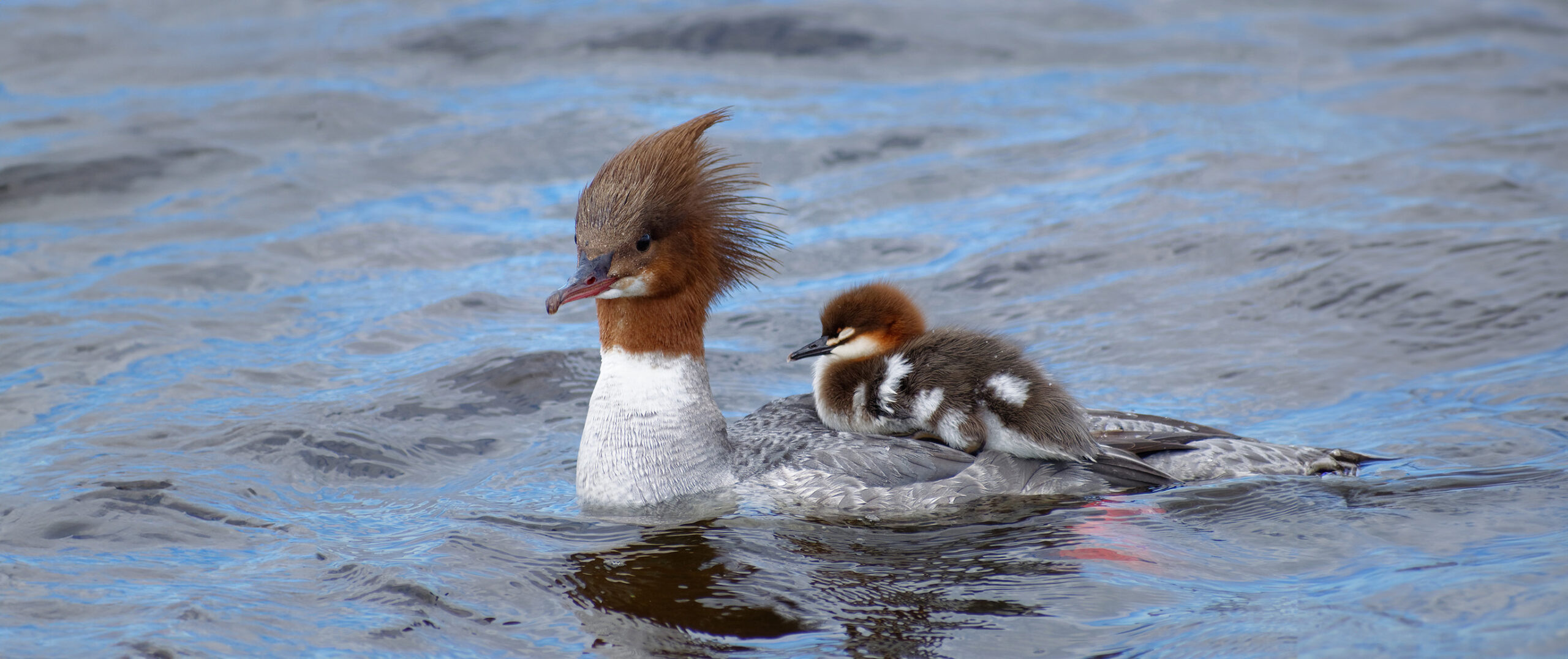
Fish-eating birds, such as mergansers, are susceptible to entanglement and drowning in fishing gear.

Figure 4.25.
Spatial distribution and relative intensity of seal hunting in the Baltic Sea during 2016-2021. Source: HELCOM 2023e.

Figure 4.26.
Spatial distribution and relative intensity of waterbird hunting in the Baltic Sea during 2016-2021. Total numbers include both game hunting and control hunting. Source: HELCOM 2023e.

Figure 4.27.
Assessment results from the assessment of seafloor disturbance. Source: HELCOM 2023d.

Figure 4.28.
Estimated seabed area potentially lost due to human activity for each Baltic Sea sub-basin, given as square kilometres. Values were estimated from spatial data on human activities identified as causing physical loss. Dark red indicates sub-basins where up to 1-10% of the total area could be lost. For the other sub-basins, the potentially lost seabed area was estimated to cover less than 1% of the total area. Source: HELCOM 2023d.

Figure 4.29.
Evaluation result of the indicator for cumulative impacts of physical pressures on benthic biotopes in the Baltic Sea, based on reported data for 2016-2021. The map indicates the combined potential impact of physical disturbance (see Box 15). Information on physical pressures from bottom trawling fishery is missing for the area off the coast of Oblast Kaliningrad, marked with a semi-transparent grey triangle. White areas within the Baltic Sea area represent regions with no impact. Source: HELCOM 2023a.

Figure 4.30.
Marine protected areas are spatially defined areas that are selected for protection because they can be particularly useful to safeguard marine ecosystems, processes, functions, habitats and species.
© Juuso Haapaniemi

Figure 4.31.
Current HELCOM marine protected areas 2016-2021.

Figure 5.1.
The Baltic Sea Pressure Index shows the spatial variation in the potential cumulative pressure on the Baltic Sea by combining data on several pressures. The index is based on the currently best available regional data, but spatial gaps may occur in some underlying data sets. The inset data availability map shows data availability for human activities (HA) and pressures (PL). Source: HELCOM 2023e.

Figure 5.2.
The distribution of the potential cumulative impact from human activities on the Baltic Sea environment, based on the Baltic Sea Impact Index. The analysis is based on the currently best available regional data, but spatial gaps may occur in some underlying data sets. The inset data availability maps show data availability for human activities (HA), pressures (PL) and ecosystem components (EC). Source: HELCOM 2023e.

Figure 5.3.
Ranking of pressures based on their potential cumulative impact measured by the Baltic Sea Impact Index. The values in the figure represent the sum of the impact index values for the whole assessment area. For details, see HELCOM (2023e).

Figure 5.4.
Average potential cumulative impact per square kilometre by HELCOM sub-basin according to the Baltic Sea Impact Index 2016-2012. For details, see HELCOM (2023e).

Figure 5.5.
Illustration of areas with high potential to contribute to ecosystem services in the Baltic Sea. The map is made from 54 different ecosystem component layers based on their respective contribution to specific ecosystem services. For a more detailed description of the data and analyses, see HELCOM (2013d-e) and Ruskule et al. (2023).

Figure 5.6.
Operational wind farms in the Baltic Sea during 2016-2021. Several more offshore wind farms are currently in planning. The expansion of offshore wind is a key topic for sustainable environmental management, in which MSP plays a central role. Please note that the symbols in the map are enlarged to make them visible at this scale. Source: HELCOM 2023e

Figure 5.7.
Several human activities coexist within the Baltic Sea, interacting with or affecting the marine environment.

Figure 5.8.
Key shipping lanes in the Baltic Sea.
